Annual Report
|
#2 of 6 :: Adirondack Museum Annual Report
|

|
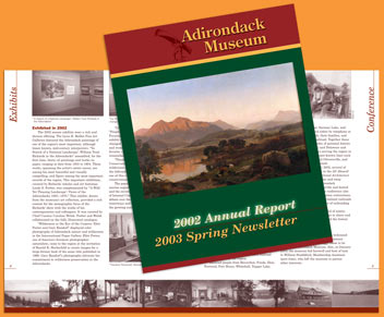
The Adirondack Museum loved the sign system
we designed and wanted consistency
with their printed membership pieces. This is one of a series
of annual reports and newsletters using the top masthead
which is similar in design to the entry sign and uses the
same colors and fonts. The photographs along the bottom of
inside pages reflect the ever-popular photobelt. The two-color
inside uses a warm black to create a sepia-tone look on the
photos, with optimim contrast on the type. A four-color process
cover highlights a painting from the current exhibition. |
return to list of report projects »